Design system from scratch: Color & typography (3/10)

Namaste! 🙏 Since the last article, I’ve defined a few things-
1. It’s going to follow atomic design methodology
2. I’m making it for mobile only for now. While making variables, I will keep in mind that it will be at some point considered for desktop(Let’s say in phase 2)
Based on the values we selected in our last article, I’ve thought about colours and typography.
Color:
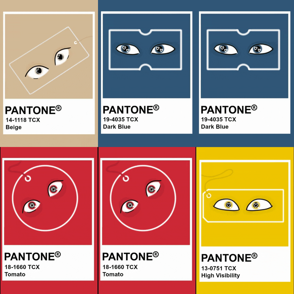
Now, when it comes to colors, I’ve gone wild! No corporate restrictions here. Since there’s no brand to dictate the hues, I’ve chosen my own primary color. I’ve avoided green, red and orange. In my system, they’re reserved for success, error, and warning.

My primary color? Drumroll, please… it’s Blueeeee!
Typography
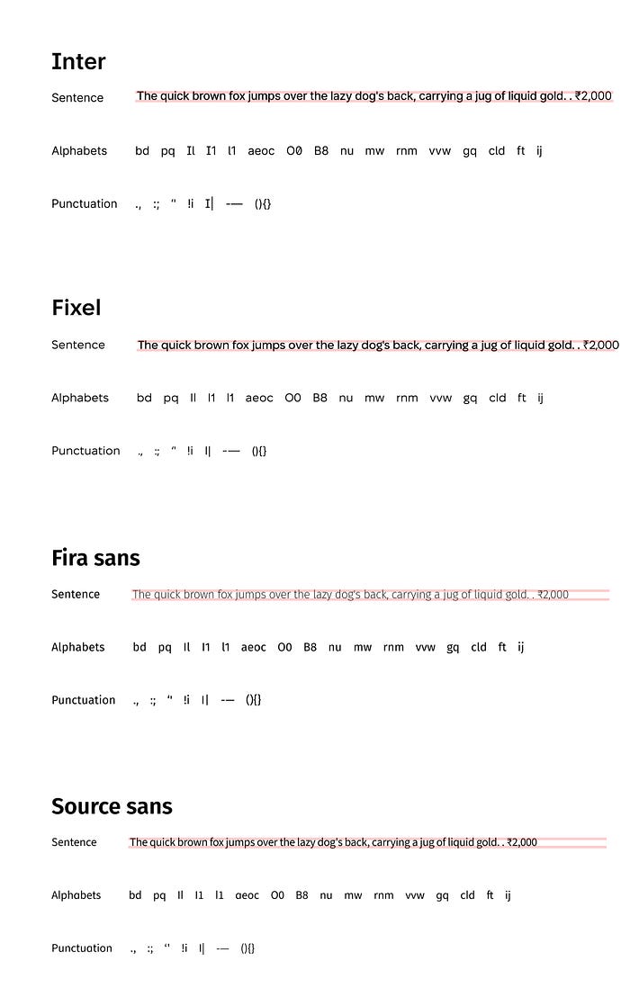
To keep it simple yet semi-formal, I’ve handpicked a bunch of typefaces — Inter (obviously), Fira Sans, Open Sans, and Source Sans. I did some alphabet aerobics, checked their kerning, line height, and punctuation game.
After a showdown, the winner? Fira Sans! It took some serious self-convincing not to go with the reliable Inter 😆

Bonus Blogs, Anyone? 🤔
Want to know more about typography and colors? Drop a comment and let me know if you’re up for bonus blogs! Until then, let the colors pop, and the letters dance in our very own design system! 💃🎉
